
welcome to
Proposal
Reading has become increasingly popular over the years because of the use of social media. One popular trend that has gained a huge following on TikTok is called Blind Date with a Book where influencers promote people to stay in, get cozy, and dive into an adventure of a random book based off of a genre you choose. With this trend as the influence, I created and designed a Blind Date with a Book inspired subscription box company that focuses on promoting reading to not only avid readers but to new and hesitant readers to take a chance at getting into a new genre or picking up reading as their new activity of choice.
Fictional Fling is not only a subscription box company, but it fully dives into what book lovers like; from genre-based stickers, bookmarks, and tote bags to having popular highly recommended books at their fingertips. The subscription box company is one of the many solutions out there to help promote reading to people of all ages.
The primary target audience will be young adult females within the ages of 18-29 who according to a 2021 survey from statista.com, “it was founded that 83% of adults aged between 18 and 29 years old had read a book in any format in the previous year, up by 2% from the share who said the same in 2019” (Watson, 2023). Even though my target audience is for young adult females, it is important to state that subscription boxes are popular with younger consumers and reading books is most popular within females. According to sherpack.com, “the subscription box market shows that women are more common buyers than men by about 60 to 40%” (sherpack.com, n/a). It is also important to understand that people older than the target audiences are still encouraged and welcomed to purchase this subscription box as they can and still would enjoy the books that are shown in many reveals online.
Deliverables:
1 primary logo
A full website, focusing on mobile first then desktop
1 Email newsletter
4 stickers
Thank you card
2 tote bag designs
3 bookmarks
4 tea packaging sleeves
subscription box packaging for 1 large (2 book) box & 1 small (1 book) box
Citation
N/A. “7 Subscription Box Trends.” Sherpack.com. https://www.sherpack.com/7-subscription-box-trends/. Accessed January 23, 2025.
Watson, Amy. “Book Readers in the U.S. by Age 2021 | Statista.” Statista.Com, 25 Oct. 2023, www.statista.com/statistics/249787/book-reading-population-in-the-us-by-age/. Accessed January 23, 2025.
Objectives
Research Synopsis
To independently research, design, and produce a logo, box packaging, bookmarks, stickers, thank you card, website, tea packaging sleeves, tote bag designs, and an email newsletter for a Blind Date with a Book inspired subscription box company called Fictional Fling.
To produce and design a cohesive, functional, well branded project where all components are fun, engaging, and fit with the overall aesthetic of the inspired Blind Date with a Book trend established for the brand.
To evaluate all designed components by self-critiquing throughout in order to create high quality work while applying all critiques given by peers and instructor, if necessary.
To apply the knowledge and technical skills such as structure, color theory, and typography with skills of packaging, branding, illustration, and photography to all required components.
To understand and research the Blind Date with a Book trend that is inspiring the overall project.
To research and execute a new original brand name and logo that exemplifies the overall aesthetic of the Blind Date with a Book trend.
To produce and apply perfect craftsmanship and overall presentation of all deliverables that are required for project completion.
Lorem ipsum dolor sit amet, consectetuer adipiscing elit, sed diam nonummy nibh euismod tincidunt ut laoreet dolore magna aliquam erat volutpat. Ut wisi enim ad minim veniam, quis nostrud exerci tation ullamcorper suscipit lobortis nisl ut aliquip ex ea commodo consequat. Duis autem vel eum iriure dolor in hendrerit in vulputate velit esse molestie consequat, vel illum dolore eu feugiat nulla facilisis at vero eros et accumsan et iusto odio dignissim qui blandit praesent luptatum zzril delenit augue duis dolore te feugait nulla facilisi.
Lorem ipsum dolor sit amet, cons ectetuer adipiscing elit, sed diam nonummy nibh euismod tincidunt ut laoreet dolore magna aliquam erat volutpat. Ut wisi enim ad minim veniam, quis nostrud exerci tation ullamcorper suscipit lobortis nisl ut aliquip ex ea commodo consequat. Lorem ipsum dolor sit amet, cons ectetuer adipiscing elit, sed diam nonummy nibh euismod tincidunt ut laoreet dolore magna aliquam erat volutpat. Ut wisi enim ad minim veniam, quis nostrud exerci tation ullamcorper suscipit lobortis nisl ut aliquip ex ea commodo consequat.
Lorem ipsum dolor sit amet, cons ectetuer adipiscing elit, sed diam nonummy nibh euismod tincidunt ut laoreet dolore magna aliquam erat volutpat. Ut wisi enim ad minim veniam, quis nostrud exerci tation ullamcorper suscipit lobortis nisl ut aliquip ex ea commodo consequat. Lorem ipsum dolor sit amet, cons ectetuer adipiscing elit, sed diam nonummy nibh euismod tincidunt ut laoreet dolore magna aliquam erat volutpat. Ut wisi enim ad minim veniam, quis nostrud exerci tation ullamcorper suscipit lobortis nisl ut aliquip ex ea commodo consequat.
Process Narrative
Lorem ipsum dolor sit amet, consectetuer adipiscing elit, sed diam nonummy nibh euismod tincidunt ut laoreet dolore magna aliquam erat volutpat. Ut wisi enim ad minim veniam, quis nostrud exerci tation ullamcorper suscipit lobortis nisl ut aliquip ex ea commodo consequat. Duis autem vel eum iriure dolor in hendrerit in vulputate velit esse molestie consequat, vel illum dolore eu feugiat nulla facilisis at vero eros et accumsan et iusto odio dignissim qui blandit praesent luptatum zzril delenit augue duis dolore te feugait nulla facilisi.
Lorem ipsum dolor sit amet, cons ectetuer adipiscing elit, sed diam nonummy nibh euismod tincidunt ut laoreet dolore magna aliquam erat volutpat. Ut wisi enim ad minim veniam, quis nostrud exerci tation ullamcorper suscipit lobortis nisl ut aliquip ex ea commodo consequat. Lorem ipsum dolor sit amet, cons ectetuer adipiscing elit, sed diam nonummy nibh euismod tincidunt ut laoreet dolore magna aliquam erat volutpat. Ut wisi enim ad minim veniam, quis nostrud exerci tation ullamcorper suscipit lobortis nisl ut aliquip ex ea commodo consequat.
Lorem ipsum dolor sit amet, cons ectetuer adipiscing elit, sed diam nonummy nibh euismod tincidunt ut laoreet dolore magna aliquam erat volutpat. Ut wisi enim ad minim veniam, quis nostrud exerci tation ullamcorper suscipit lobortis nisl ut aliquip ex ea commodo consequat. Lorem ipsum dolor sit amet, cons ectetuer adipiscing elit, sed diam nonummy nibh euismod tincidunt ut laoreet dolore magna aliquam erat volutpat. Ut wisi enim ad minim veniam, quis nostrud exerci tation ullamcorper suscipit lobortis nisl ut aliquip ex ea commodo consequat.
Process Work: Logo
When I was starting to figure out the name for this company, I started out with a different aesthetic in mind. I originally had a cottage core aesthetic with the name of Boundless Adventures, but I soon realized that it was not the correct direction for my company and I decided to lean into the dating aesthetic that is part of the Blind Date with a Book trend where the name Fictional Fling was born. Throughout the logo process I messed with visual ideas that represent the dating side of the trend by trying to pair different typography, interactions, and symbols that symbolize the word fiction or show the cheesy or cliche way dating is show like cursive typography, hearts, and paper airplanes.
Required Components/Content (on your website):
Proposal, including project scope and deliverables;
Detailed company/organization/thing-that-you-are-designing profile (2-3 Paragraphs)
Detailed target audience information (1-2 Paragraphs);
Objectives;
Research synopsis (2-3 Paragraphs);
Process narrative (2-3 Paragraphs + process work examples);
All designed elements of your project appropriately displayed and explained.
What is Fictional Fling?
Fictional Fling is a blind date with a book inspired subscription box company from the trend found on TikTok that focuses on promoting reading to not only avid readers, but to new and hesitant readers to take a chance at getting into a new genre or picking up reading as their new activity of choice.
Fictional Fling’s mission is to create a fun way to get a personalized book experience with a random book sent to you from a genre chosen by you with the goal of giving you [the reader] an excuse to have a date night with your favorite genres and fictional characters in the comfort of your own home without the hassle of crowded spaces and traffic experiences of going out on an actual date. Fictional Fling is changing the cultural norm by stating that it is okay to stay in, get cozy, and just enjoy not only alone time but a good book.
Target Audience
According to thecut.com, “Adults—as in, people age 18 or older—now account for nearly 80 percent of sales of young adult titles…” (Dahl, 2014). Due to the rise of book sales within adults, my target audience is young adult females within the ages of 18-29 years old due to rise in social media influencing Generation Z to give reading a chance by diving into an adventure of a highly rated book. Marketingcharts.com states, “eighty-four percent of Echo Boomers 18-33 who have read a book in the past year have read a fiction book, compared to 76% of both Baby Boomers 46-64 and Matures 65 and older” (marketingcharts.com, 2010). Fictional Fling’s target audience is women within this demographic because reading is primarily more popular within females and social media, like TikTok, is promoting reading within this target audience by forming a reading community within genres that are more popular with females.
Thecut.com also states, “overall, 60.5 percent of the young adult books sold were purchased by women, and 39.5 percent were bought by men. That gender disparity mirrors Pew research from January showing that men read fewer books of any genre—an average of four a year, as compared to six for women” (Dahl, 2014). When thinking about books, the genres that are promoted the most on social media and on book store websites, like Barnes and Noble, are fantasy, romance, mystery/thriller, and young adult fiction that often appeals more to female readers. Marketingcharts.com also states, “Female fiction readers have read mystery/thriller/crime books at a much higher rate than male readers (57% compared to 39%), although it is the most popular genre for both genders. The most pronounced difference is in the rate of reading romance books (37% of women compared to 3% of men)…” (marketingcharts.com, 2010). With the rise of technology, the use of social media, and popular trends found online, book consumption is more predominantly found within my demographic of my company (18-29 year olds) due to younger adults growing up with the use of social media where many book promotions are found and trends like Bind Date with a Book and the rise of stickers being used as a way to express younger adults are found to be more popular within my demographic than it is for older adults. Although, it is important to state that people older than the target audience is still welcome and encouraged to purchase this subscription box as the books that are shown in unboxings online can and still would be enjoyed by older audiences.
Citation
Dahl, Melissa. “The Dudes Who Read Young-Adult Fiction.” thecut.com. 8 June 2014. https://www.thecut.com/2014/06/dudes-who-read-young-adult-fiction.html. Accessed April 1, 2025.
n/a. “Female, Younger Readers Biggest Fiction Fans” marketingcharts.com, 7 Oct. 2010. https://www.marketingcharts.com/industries/media-and-entertainment-14476. Accessed April 1, 2025.
Round 1: Roughs
Once I settled on Fictional Fling, I decided on trying to combine books and elements of dating together by using hearts, paper airplanes, cursive typography, locks, bookmarks, and of course books.
critique from this round:
take 3, 7-9, 12, 13, 14, & 15 to process out
make the airplane not look like it is crashing

Round 3: Comps
Critique from this round:
no secondary type underneath fictional fling (sounds weird and is not needed)
no moons on the top of the i
process out 6 & 7
make the dots of the i smaller, too large & distracting
work on the overlapping of the text, it feels awkward

Round 4: Final comps
This critique was simply choosing which aesthetic was the best option. I was not against either of the options and just wanted a consensus class vote.
established that one heart was the better option and the cursive typography used for the word “fling” read more on the dating side of the inspired trend. The word “fictional” is pushing towards the book side of the trend that read as a stronger logo for the overall aesthetic of the brand. The other option read as a simple logo and gave more of the book side of fictional fling and not both.

Process Work: Bookmarks
When figuring out the idea that I have for my bookmarks, I started scrolling on Pinterest to see what is trending and popular with the bookmark designs. I discovered that the most popular type of bookmark was genre related themes (for example book tropes or aesthetics found within specific genres) with the bookmark being contained in the standard rectangle size. With this idea in mind, I did not want to do what is seen all over Pinterest, but push beyond the boundaries seen. I wanted to do a die cut bookmark that is breaking the boundary of a standard sized bookmark size. My bookmarks are not only genre based, but it is popular elements based off of the mystery, romance, and fantasy genres. Towards the end of the process, I originally imagined these being one sided but I thought about adding elements for new readers to reference to learn more about the tropes of the genres the bookmarks are about.
Round 1: Thumbnails
Round 2: Roughs
Rough critique
fix misspelling
mess with the placement of the type
fix the dragon illustration (leg to tail area)
take away the bow on roses & third rose


Round 3: Roughs
Rough critique
continue process on dragon’s leg & tail overlap
add logo to bookmarks
consider doing a two sided bookmark
rearrange type on fantasy bookmark (group text better)


Round 4: Comps
Comp critique
fix the type on the back of bookmark, keep it within the rectangle do not run text into die cut area
shorten the text on the back


Process Work: Stickers
With the same thought process that went into figuring out the aesthetic I wanted to do for the bookmarks I did for the stickers, I originally wanted to do tarot card themed stickers with a modern twist. While I was processing the stickers out, I established that it was better to go into a direction that was showing a light influence to tarot cards with more of a push towards genre based stickers to connect to the bookmarks.
Round 1: Thumbnails

Round 2: Roughs
Rough critique
change to genre based stickers by changing the reader to horror with a small tarot card influence (not the main focus)
take away the words under the illustration
fix the exhibit A sign on the mystery (awkward cut)
fix the awkwardness the skeleton illustration has towards the bottom of the sticker


Round 3: Roughs
Rough critique
add logo to stickers somehow
fix the ghosts on the horror (grim reaper) sticker (less pac-man)
make the grim reaper’s sleeve come down into the border of the sticker
fix the shoulder of the grim reaper


Round 4: Comps
Comps critique
take out third rose
rotate the grim reaper to make the scythe sit at a diagonal to fit the logo better in the space


Process Work: Tea Packaging Sleeves
For the tea packaging sleeves, I had this idea before starting. I knew I wanted to do tea puns with elements from popular book covers being replaced with tea related elements.
Round 1: Thumbs
Round 2: Roughs
Rough critique
make the books based off of well known books that everyone would know (like books made into movies or classics) and not so much on popular books found on social media


Round 3: Thumbs Round 2
Round 4: Roughs
Roughs critique
change the illustration to a cup on the Lord of the Chais
make Fifty Shades of Earl Grey photographic, not illustrative to fit with the book cover aesthetic

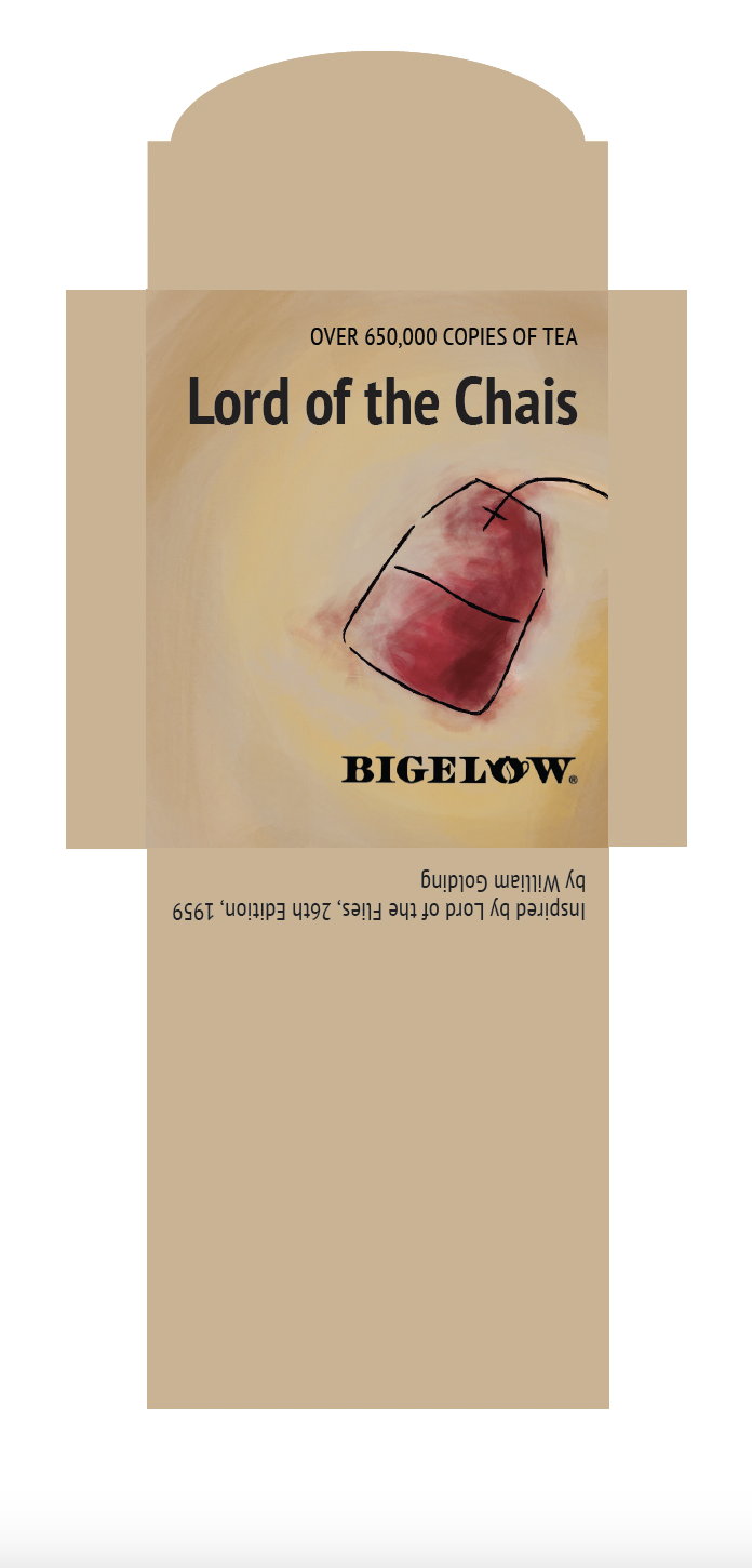


Round 4: Comps
Comp critique
do a different book cover for Lord of the Chais (illustration is not working)


Final
Below is a photo of all the components of what the consumer would get when they purchase a book box. After that, fill free to scroll down to see each component separately.
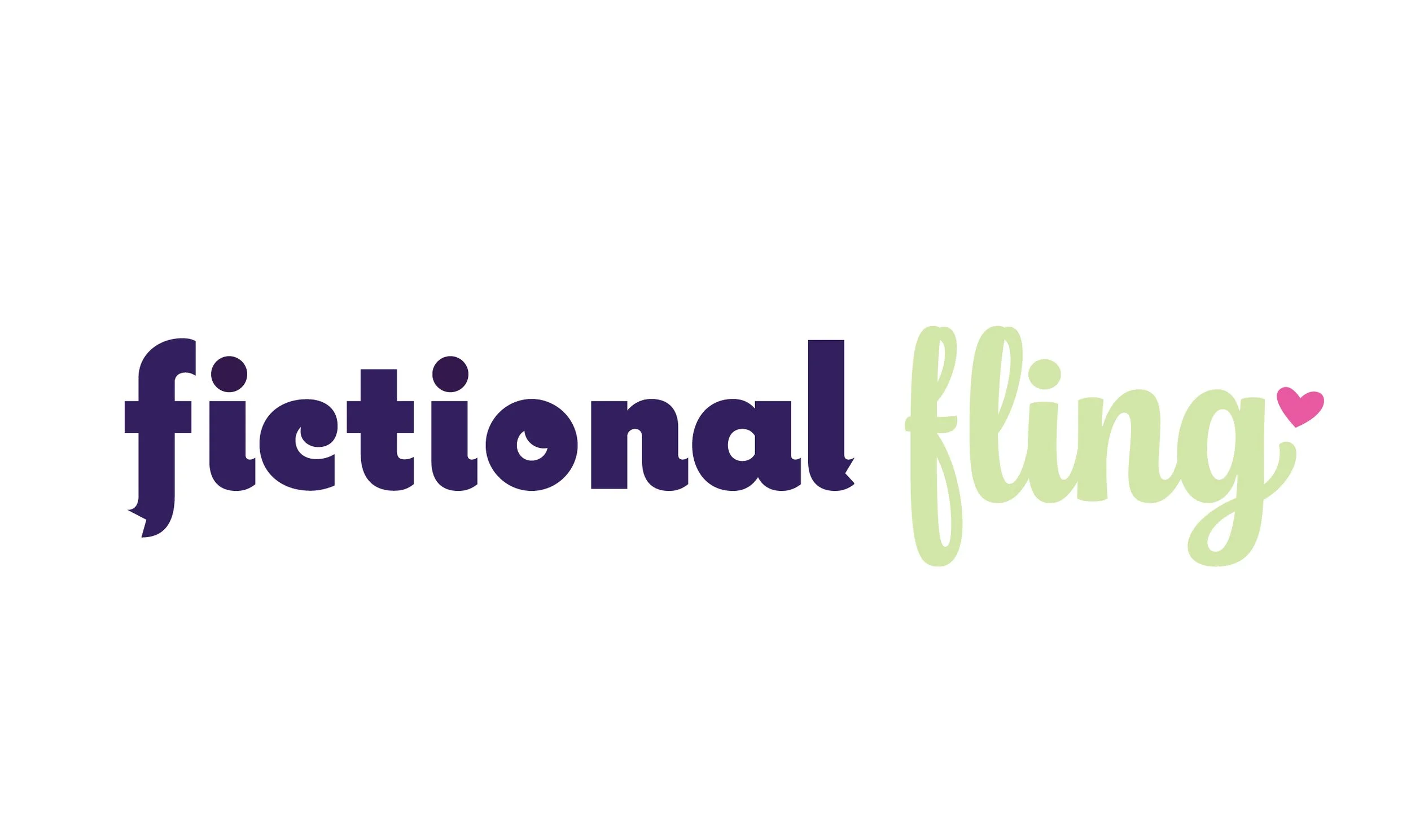
Final: Logo
During the process of establishing this logo, the cursive type for the word “fling” of the logo read more on the dating side of the Blind Date aspect of the Blind Date with a Book trend that inspired this project. The cursive typeface, called Chonky, was paired with the word “fictional” that read more on the book side due to the modifications that I did to the typeface Coquette with the f and the l looking like a bookmark. Out of all the variations, this final logo read as a stronger logo for the overall book blind date aesthetic that I wanted this brand to be.
Final: stickers
Final: Bookmarks
Final: Subscription Boxes with wrapped books
Each box will come with a wrapped book made from the same pattern found on the bottom of the inside and the left and right side of the boxes. Each book also has a tag that is telling you what genre it is, and some information that includes the first line of the first chapter of the book, settings, and tropes that the book has. The boxes are made to feel the same but with slight differenations to established the different box options while using the same color scheme for both. The large box is a dark purple with a teal inside panel and the small box is a dark blue with a pink inside panel. Each box has a different saying on the outside with the inside having the same saying to tie into the consistency of the overall brand.
Final: Thank You Card
Each card is for the different colored boxes using the same colors. The large box gets the dark purple card with a baby teal back and the small box gets the dark blue with the baby pink back. The back of the cards are using the same pattern and same opening saying of “get cozy, it’s date night!” but each card has a different subheading that is focusing on the dating aspect of the brand.
Final: Tea Packaging Sleeves
Final: Email Newsletter
prototype link:
Final: Websites
prototype link - desktop:
prototype link - mobile: